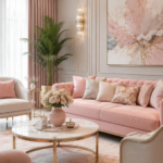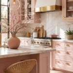
There’s a reason pink and navy keep showing up in the bathrooms design lovers save the most. It’s rich without being loud, feminine without being fussy, and it photographs beautifully in every kind of light. If you’ve been staring at a plain white bathroom wondering how to give it some personality, this colour combination might be exactly what you’re looking for.
This guide walks through everything you need to bring a pink and navy bathroom to life — from the right shades to pick, to furniture, lighting, layout, and the small mistakes that can throw the whole look off balance.
Why This Colour Combination Works So Well
Pink and navy sit on opposite ends of the colour wheel in terms of mood. Navy is deep, grounded, and a little formal. Pink is soft, warm, and playful. Put them together and you get a room that feels both calm and characterful — not an easy balance to strike with just one colour alone.
There’s also a practical reason designers reach for this pairing again and again: navy behaves almost like a neutral. It pairs with brass, marble, chrome, and wood without a fight, which means you have far more flexibility with fixtures and finishes than a lot of bold colour schemes allow.
Pink softens navy’s formality. Navy stops pink from tipping into overly sweet territory. Used together, they create a bathroom that reads as considered and expensive, even on a modest budget.
Choosing Your Colour Palette
The trick with pink and navy is picking shades that complement rather than compete. A few reliable pairings:
| Pink Shade | Navy Shade | Mood |
|---|---|---|
| Dusty rose | Deep indigo | Warm, romantic |
| Blush pink | Classic navy | Soft, timeless |
| Terracotta pink | Ink navy | Moody, dramatic |
| Pale pink | Petrol navy | Fresh, modern |
A general rule that holds up in almost every bathroom: let one colour lead and the other support. A navy vanity with blush walls feels different from blush tile with a navy ceiling — both work, but they set very different tones.
If you’re nervous about going bold, start with a 70/30 split. Seventy percent neutral or soft pink, thirty percent navy in a statement piece like a vanity, an accent wall, or the tile surround.
Undertones Matter More Than You Think
Pink undertones can be warm (peachy, coral-leaning) or cool (mauve, lilac-leaning). Navy can lean slightly purple, slightly green, or true blue. Mismatched undertones are usually the reason a pink-and-navy room feels “off” even when the shades look fine individually on paint chips.
Before committing, hold your paint or tile samples together in the actual room, at the time of day you’ll use the bathroom most. Morning light and evening light will shift both colours noticeably.
Furniture and Fixture Ideas
The Vanity
The vanity is usually the anchor piece in a pink and navy bathroom, and it’s where most of the colour decision-making happens.
- Navy vanity, pink walls: This is the safer, more classic route. The vanity feels furniture-like and substantial, while the walls stay light and airy.
- Pink vanity, navy walls: Bolder and more editorial. Works best in larger bathrooms with good natural light, since dark walls in a small, dim room can feel heavy.
- White vanity, pink and navy accents: A good middle ground if you’re renovating on a budget or renting and can’t commit to painted cabinetry.
Shaker-style or fluted cabinet fronts tend to suit this palette better than ultra-modern flat panels — the extra texture keeps the colour from feeling flat.
Countertops and Hardware
Warm-toned stone (think Calacatta gold, or a soft beige travertine) bridges pink and navy nicely. Brass or unlacquered brass hardware pulls warmth from the pink and adds a sense of luxury against the navy. Chrome or nickel hardware, by contrast, gives a cooler, more contemporary finish.
Bathtub as a Statement Piece
A freestanding tub in navy or matte black creates real drama against pink tile or pink walls. If a full colour tub isn’t in the budget, a white tub with a pink or navy tub surround delivers a similar effect for less.
Layout Tips for a Pink and Navy Bathroom
Layout decisions affect how bold you can go with colour.
- Wet areas first. Decide where the shower, tub, and toilet sit before choosing which surfaces get which colour — tile decisions are the hardest to change later.
- Balance dark and light across the room, not just on one wall. If navy is only on the vanity, echo it somewhere else (a mirror frame, a light fixture, a floor tile) so the colour doesn’t feel like an afterthought.
- Keep sightlines in mind. The first wall you see when the door opens is the best place for your boldest colour moment, since it sets the tone for the whole room.
- Zone with flooring. Patterned pink-and-navy floor tile can define a shower zone or a vanity area without needing extra walls.
Lighting That Flatters Both Colours
Lighting changes how saturated pink and navy read, so it deserves real thought rather than an afterthought fixture from the hallway.
- Warm white bulbs (2700K–3000K) bring out the warmth in blush and dusty rose tones and keep navy from looking flat or cold.
- Layered lighting — a statement pendant, wall sconces beside the mirror, and a small amount of ambient ceiling light — reads as far more luxurious than a single overhead fixture.
- Brass or unlacquered brass fixtures tie the metal tones together and add warmth that plain chrome doesn’t offer in this palette.
- Dimmers let you shift the room from bright and functional in the morning to soft and moody for an evening bath.
Natural light is worth planning around too. North-facing bathrooms get cooler, bluer daylight, which can make navy feel heavier than expected — consider warmer artificial lighting to compensate. South-facing rooms get warmer light that flatters pink beautifully most of the day.
Common Styling Mistakes to Avoid
- Using too many pink and navy shades at once. Two of each, maximum, in most bathrooms. More than that and the room starts to look like a mood board rather than a finished space.
- Skipping a neutral base. White, cream, or warm grey grout, countertops, or ceiling gives the eye somewhere to rest between the two bold colours.
- Matching metals inconsistently. Mixing brass, chrome, and matte black in the same small room usually reads as unplanned rather than eclectic.
- Forgetting texture. Flat paint on flat tile can make even a well-chosen palette feel one-dimensional. Add texture through fluted cabinetry, ribbed glass, or a textured tile.
- Going too dark in a windowless bathroom. Navy needs some light source — natural or well-planned artificial — to avoid feeling like a cave.
Small Space Ideas
A small bathroom can absolutely handle this palette, with a few adjustments:
- Use pink as the dominant colour and navy as the accent, rather than the reverse — dark colour in a small footprint can shrink the room visually if it’s not balanced carefully.
- A navy vanity paired with pale pink walls keeps a small room grounded without feeling boxed in.
- Vertical navy tile (running floor to ceiling in the shower) draws the eye upward and makes low ceilings feel taller.
- A large mirror with a brass or navy frame bounces light around and helps the colour feel intentional rather than cramped.
- Keep hardware and fixtures in one metal finish in small spaces — the fewer competing elements, the calmer the room feels.

Budget-Friendly Options
You don’t need a full renovation to bring this look into a bathroom.
- Paint over tile. A high-quality tile and tub paint can turn dated beige tile navy or blush for a fraction of the cost of retiling.
- Peel-and-stick wallpaper. Pink and navy patterned wallpaper is widely available in removable versions, which is ideal for renters.
- Swap hardware and accessories. New brass taps, a navy bath mat, pink towels, and a new mirror can shift the whole feel of a bathroom in an afternoon.
- Paint the vanity instead of replacing it. Cabinet paint made for high-moisture rooms can turn an existing vanity navy or blush without a full cabinet swap.
- Add a statement light fixture. One well-chosen pendant or sconce set does more for the “expensive” feel of a room than most people expect.
Luxury Alternatives
If budget isn’t the constraint and you want the elevated version of this palette:
- Book-matched marble in soft pink or warm-veined stone as a shower surround.
- Custom navy lacquered cabinetry with brass inlay detailing.
- Terrazzo flooring that incorporates both pink and navy chips for a bespoke, high-end floor.
- A freestanding navy or blush soaking tub as the centrepiece, positioned to catch natural light.
- Fluted glass shower screens in a soft bronze frame, which soften the line between the two bold colours.
DIY Improvements Worth Trying
- Reglaze or paint an old bathtub in matte navy for a dramatic, budget-conscious focal point.
- Stencil a simple navy border onto pink tile grout lines for a custom look without full retiling.
- Build a floating navy vanity shelf and pair it with a pink vessel sink for a quick weekend upgrade.
- Reupholster a vanity stool in a pink or navy fabric to tie the palette together.
- Frame an existing mirror in brass or navy trim instead of buying new.
Frequently Asked Questions
Does pink and navy work in a small bathroom? Yes, as long as one colour leads and the other supports. Lean on pale pink as the main colour with navy as an accent for the best results in tight spaces.
What metal finish suits pink and navy bathrooms best? Brass and unlacquered brass are the most common choices because they add warmth to both colours. Matte black also works well in more modern, moody schemes.
Will this palette date quickly? Pink and navy have shown up in interiors for decades in different forms, from Art Deco to modern farmhouse. Choosing muted, dusty shades rather than bright, saturated ones tends to age better long-term.
Can I use this palette in a rental bathroom? Yes. Removable wallpaper, new hardware, textiles, and a statement mirror can bring the look in without any permanent changes.
Should the floor be pink, navy, or neutral? A neutral or navy floor is usually the safer, longer-lasting choice, since floors are harder and more expensive to change than walls or accessories.
Final Thoughts
Pink and navy is one of those pairings that looks effortless once it’s finished but benefits enormously from planning before the first coat of paint or tile goes down. Get the undertones right, keep the metals consistent, and let one colour lead while the other supports — the rest of the room tends to fall into place naturally.