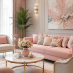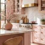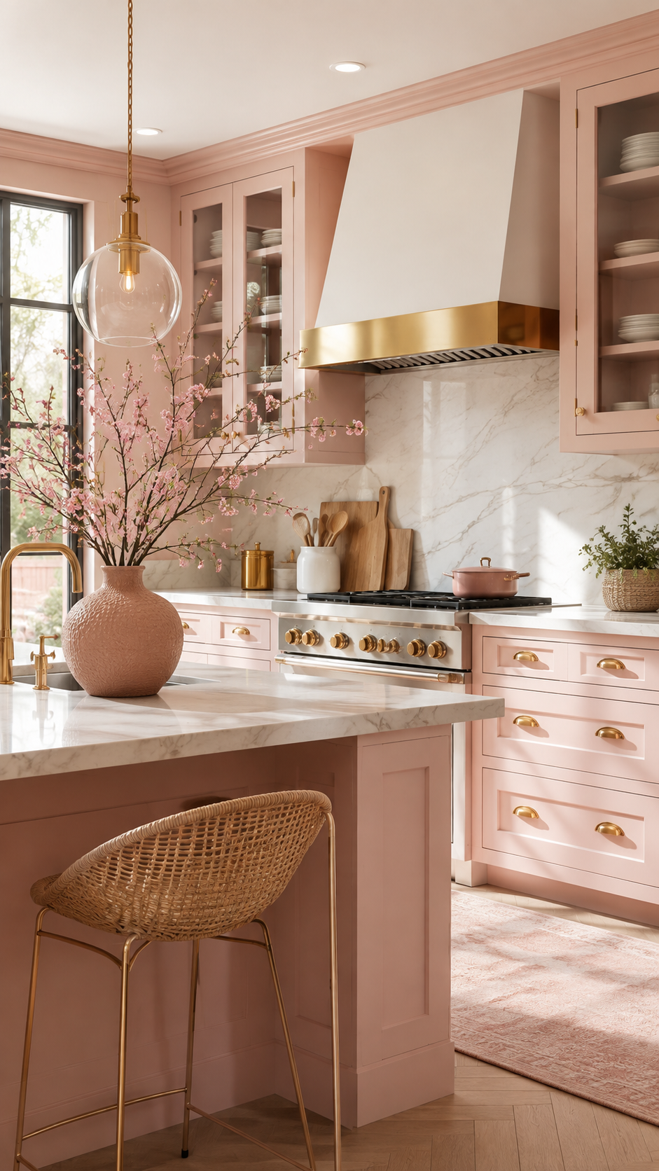
Pink in the kitchen used to mean one thing: a full commitment to sugary, candy-coated cabinetry. That version has quietly disappeared.
Blush is different. It’s pink with the volume turned down — grey and beige undertones pulled in until the color reads as warm neutral rather than statement color. That shift is exactly why it’s showing up in serious kitchen renovations, not just mood boards.
This guide breaks down how to build a blush pink kitchen that feels considered, livable, and far from a passing trend.
Why This Style Works
Blush pink succeeds in kitchens for a reason most bold colors don’t: it behaves like a neutral.
Undertone is everything. True blush carries grey, taupe, or beige beneath the pink, which keeps it from competing with stone, wood, or metal finishes the way a brighter pink would.
It flatters natural light. Morning and afternoon sun bounce softly off blush surfaces instead of glaring the way white sometimes does, giving the room a warm, lived-in glow at almost any hour.
It pairs with nearly everything. Blush sits comfortably next to warm woods, black steel, brass, sage green, and charcoal — which is part of why it works across so many different design styles rather than locking a kitchen into one look.
Designer Note: If a pink paint chip looks even slightly “bubblegum” under warm indoor lighting, it will likely read too sweet on full cabinetry. Test swatches under your kitchen’s actual light before committing.
Colour Palette: Getting the Ratio Right
The kitchens that work use blush as an accent color layered against neutrals — not as the dominant tone covering every surface.
The 60-30-10 styling formula:
| Proportion | Role | Typical Elements |
|---|---|---|
| 60% | Base neutral | White, cream, or warm stone walls and countertops |
| 30% | Blush pink | Cabinetry, island, or a feature wall |
| 10% | Accent metal or dark tone | Brass hardware, black fixtures, or walnut wood |
Best blush undertones for kitchens:
- Warm blush (peachy-pink) — pairs beautifully with brass and warm wood tones
- Cool blush (grey-pink) — reads more sophisticated next to black steel and marble
- Dusty rose — the deepest of the three, works well as an anchor color on a lower-cabinet-only application
Quick Win: Painting only the lower cabinets blush while keeping the uppers white is the fastest way to test the color commitment without a full renovation.
Cabinetry and Furniture Ideas
Cabinetry carries the most visual weight in a kitchen, so decisions here shape the entire room.
Two-tone cabinetry is the most popular application right now. Blush lower cabinets paired with white or cream uppers keep the room feeling bright while still delivering the color payoff.
Matte finishes outperform gloss. A matte or eggshell sheen on blush cabinetry softens the color and hides fingerprints far better than a high-gloss lacquer, which can read overly plastic in a warm pink.
Islands make excellent test surfaces. A blush island surrounded by white perimeter cabinetry gives the kitchen a focal point without the full commitment of wall-to-wall color.
Furniture and seating should lean neutral. Cane, rattan, or light oak bar stools keep the room from tipping into a themed, overly-pink space.
Lighting
Lighting decisions determine whether blush reads as elegant or washed out.
Warm white bulbs (2700K–3000K) are essential. Cool white or daylight bulbs can pull grey undertones out of blush paint and make it look flat or dingy.
Brass and gold fixtures amplify the warmth in blush surfaces and are the most reliable metal pairing for this palette.
Layer three light sources — overhead, under-cabinet, and a pendant or two over the island — so the color reads consistently at every time of day, not just in direct sunlight.
Layout Tips
Keep sightlines simple. In open-plan homes, a blush kitchen island is often visible from the living and dining areas, so the color should echo somewhere else in the open space — a cushion, a vase, a piece of art — to avoid the kitchen feeling visually disconnected from the rest of the floor.
Balance color placement across the room. Concentrating all the blush on one wall or run of cabinetry, with neutral surfaces everywhere else, keeps the eye moving instead of settling on one saturated block of color.
Counter material matters more than people expect. White or light grey quartz keeps blush cabinetry looking crisp; warm-toned stone can push the whole palette closer to peach than pink.
Small Space Adaptations
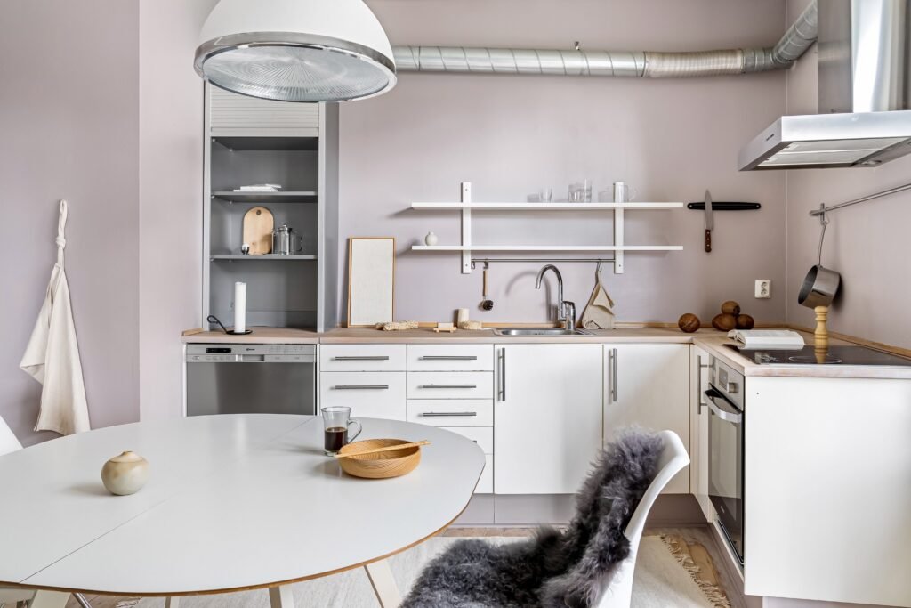
Blush pink is often assumed to be a color for larger kitchens, but it adapts well to compact layouts with a few adjustments.
- Go light and cool-toned. A pale, grey-based blush reflects more light than a deep dusty rose, which helps a small kitchen feel open rather than boxed in.
- Limit color to one plane. In a galley or single-wall kitchen, applying blush to just the cabinetry (not the walls too) prevents the space from feeling closed in.
- Use glass-front upper cabinets. These break up the color block and add visual depth in kitchens where wall space is limited.
- Add a mirrored or glossy backsplash. This bounces light around the room and keeps a small blush kitchen from feeling heavy.
Designer Note: In kitchens under 100 square feet, keeping the ceiling and trim bright white — even when walls carry color — preserves the sense of height.
Budget vs. Luxury: Two Ways to Get the Look
| Element | Budget-Friendly Approach | Luxury Approach |
|---|---|---|
| Cabinetry | Paint existing cabinets in a blush cabinet-grade paint | Custom cabinetry in a factory-lacquered blush finish |
| Countertops | Laminate in a white or light grey stone-look finish | Calacatta or Taj Mahal quartzite |
| Backsplash | Peel-and-stick subway tile in a soft white | Handmade zellige or marble mosaic tile |
| Hardware | Brushed brass hardware from a home improvement store | Solid unlacquered brass pulls and knobs |
| Lighting | Warm-white LED under-cabinet strip lighting | Blown-glass or brass pendant fixtures |
| Flooring | Vinyl plank in a warm wood tone | Wide-plank white oak, site-finished |
Both routes land in the same aesthetic territory. The difference is in material longevity and finish depth, not in whether the look reads as intentional.
Styling Mistakes to Avoid
Choosing a pink that’s too saturated. A true bubblegum or coral pink on full cabinetry rarely ages well — it reads more novelty than design-forward within a few years.
Skipping the undertone test. Paint that looks perfect on a swatch card can shift warmer or cooler once it’s on a full wall of cabinetry under your specific lighting.
Pairing blush with cool-white lighting. This combination is the single fastest way to make an otherwise well-chosen pink look tired and grey.
Overloading the room with pink accessories. Blush cabinetry needs breathing room. Piling on pink dish towels, pink small appliances, and pink wall art on top of pink cabinetry tips the room into theme-park territory.
Maintenance Note: Matte cabinet finishes in blush show grease and fingerprints more visibly around handles and edges than white or grey equivalents — a wipeable matte topcoat or a slightly satin sheen at high-touch points helps.
DIY Improvements
Not every element needs a full renovation budget.
- Repaint existing cabinet doors with a cabinet-specific enamel in a blush tone, keeping the boxes and interiors neutral.
- Swap hardware to brass or brushed gold pulls — one of the highest-impact, lowest-cost changes available.
- Add open shelving in a warm wood tone to break up a wall of color and display neutral ceramics.
- Reupholster bar stools in a bouclé or linen fabric in cream or oatmeal to soften the palette without adding more pink.
- Install a peel-and-stick backsplash in white subway or fish-scale tile as a renter-friendly way to test the two-tone look.
Style Variations
Modern Blush — matte blush cabinetry, black steel fixtures, white quartz counters, minimal hardware.
Farmhouse Blush — dusty rose lower cabinets, white beadboard uppers, farmhouse sink, brass hardware.
Japandi Blush — pale, cool-toned blush paired with light oak, matte black accents, and minimal open shelving.
Art Deco Blush — deeper dusty rose with black and brass geometric tile, statement pendant lighting, and marble countertops.
FAQ
Does blush pink make a kitchen look dated faster than white or grey? Not when the undertone leans neutral. Grey-based blush paired with warm wood and brass has held up well as a design choice over the past several years, largely because it functions more like a warm neutral than a trend color.
What wall color works best with blush cabinetry? Warm white or soft greige walls let blush cabinetry stand out without competing for attention. Avoid stark cool white, which can make the pink look slightly muddy by contrast.
Is blush pink a good choice for resale value? Applied to lower cabinetry only, with neutral counters and uppers, blush is generally considered a safe, easily-updated choice. Full-color schemes carry more resale risk and may need repainting for a broader buyer pool.
Can blush pink work in a north-facing kitchen with less natural light? Yes, with adjustments. Lean toward a warmer, peachier blush rather than a cool grey-pink, and prioritize warm-white bulbs to compensate for the lack of direct sun.
What’s the easiest way to try blush without repainting cabinets? Start with textiles and small appliances — a blush stand mixer, linen tea towels, or a runner rug — to live with the color before committing to anything permanent.
A blush kitchen, done with restraint, doesn’t shout. It just quietly makes the room feel warmer than it did before.