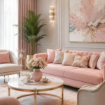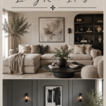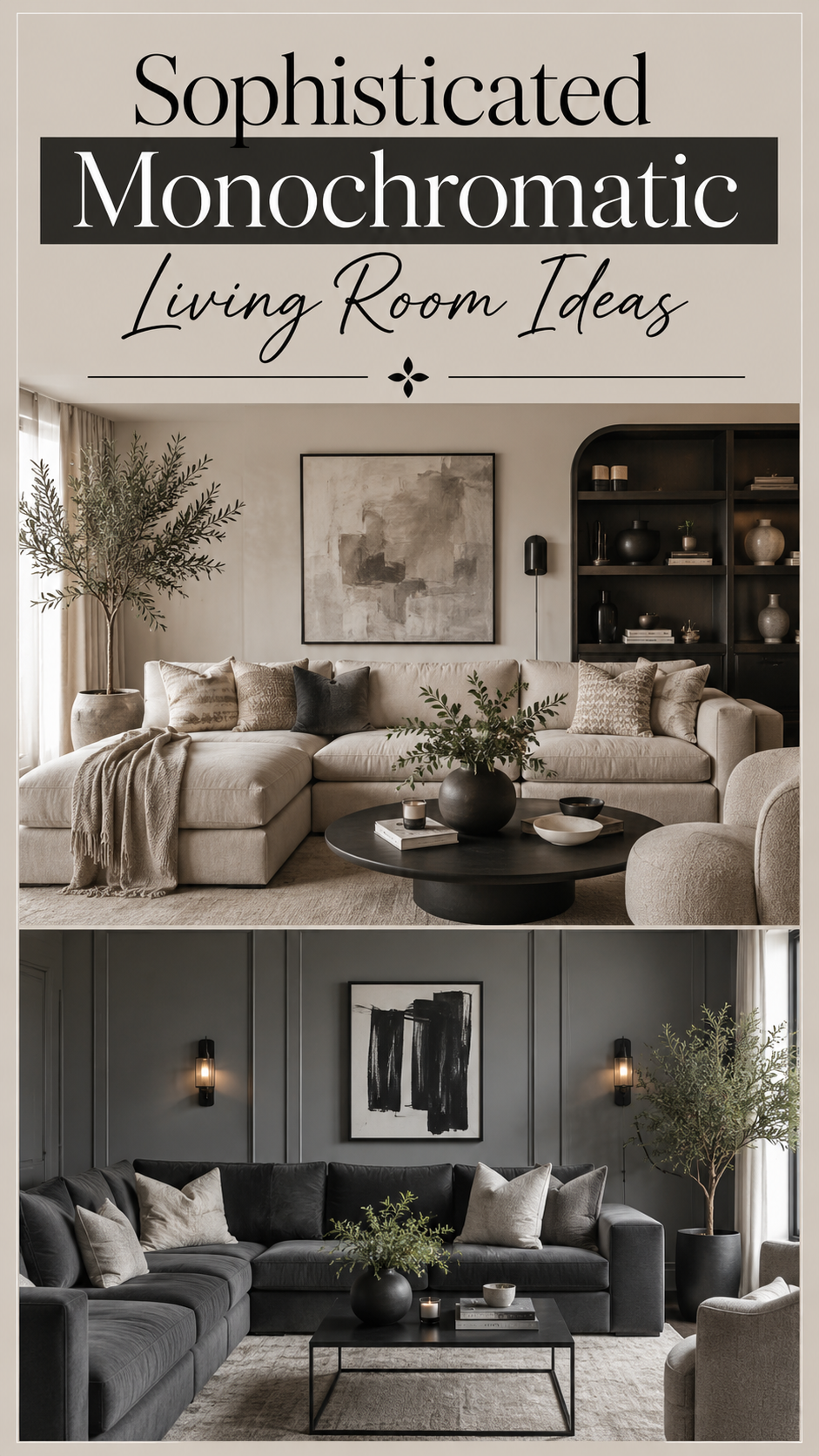
A monochromatic living room is the design equivalent of a tailored suit. One color, cut and layered with precision, reads as more expensive and more intentional than a room full of competing hues ever could.
Done wrong, monochrome can feel flat and clinical. Done right, it feels like a space that took real thought to build.
This guide breaks down exactly how designers pull off a single-color living room that still has depth, warmth, and personality — plus where to spend, where to save, and which mistakes flatten the whole effect.
Why This Style Works
A monochromatic palette removes decision fatigue from a room. When every surface pulls from the same color family, your eye isn’t jumping between competing focal points. The space reads as calm and cohesive almost instantly.
It also makes texture do the heavy lifting. Without color contrast to create visual interest, materials like boucle, velvet, linen, and wood grain step forward. This is why the best monochromatic rooms often feel richer than colorful ones — texture becomes the main character.
Monochrome photographs beautifully, too. Editorial and Pinterest-favorite interiors lean monochromatic because the lack of color noise lets architecture, light, and shadow take center stage.
Small imperfections disappear. A slightly mismatched wood tone or an odd-shaped lamp blends into a monochrome scheme in a way it never would in a multicolor room.
Colour Palette
The trick to a monochromatic room isn’t picking one color. It’s picking one color and then building a full tonal range around it — light, mid, and dark.
A reliable styling ratio to work from:
| Tone Range | Percentage of Room | Where to Use It |
|---|---|---|
| Lightest tint | 50% | Walls, ceiling, large upholstery |
| Mid-tone | 35% | Rugs, secondary seating, drapery |
| Darkest shade | 15% | Accent furniture, frames, small decor |
Popular monochromatic base colors and their mood:
- Warm greige or taupe — soft, calming, forgiving of natural light shifts through the day
- Charcoal to soft black — dramatic, moody, best with strong natural light or layered lamp lighting
- Sage or olive green — organic, grounding, pairs beautifully with wood tones
- Ivory to cream — airy, timeless, makes small rooms feel larger
- Deep navy — rich and formal, works well in rooms with limited daylight
Designer Note: Stick to one undertone across your whole range — all warm or all cool. Mixing a cool gray wall with a warm beige sofa is the fastest way to make a monochromatic room look unintentional rather than styled.
Furniture and Layout Guidance
Vary silhouette, not just color, to avoid flatness. If your sofa has clean, boxy lines, bring in a rounded coffee table or a curved accent chair. Repetition in color needs contrast in shape to stay interesting.
Anchor the room with one dramatic piece. A sculptural floor lamp, an oversized mirror, or a bold-framed piece of art in the darkest shade of your palette gives the eye somewhere to land.
Float furniture away from the walls where space allows. In a monochromatic room, negative space reads as luxury rather than emptiness — tight, wall-hugging layouts can make the palette feel cramped instead of intentional.
Layer at least three textures per seating area. A boucle armchair, a leather ottoman, and a linen throw in the same color family will always outperform three pieces in the same fabric.
Lighting
Monochromatic rooms live or die by their lighting plan. Flat overhead light flattens tonal variation and makes the whole room read as one dull block.
- Use three light sources minimum: ambient (ceiling or recessed), task (a reading lamp), and accent (a picture light or uplight on texture)
- Warm bulbs (2700K–3000K) suit beige, taupe, and cream palettes — they deepen the coziness
- Cooler bulbs (3500K+) suit charcoal and navy palettes — they keep dark tones from feeling murky
- Dimmers are close to essential in a single-color room, since they let you shift the mood without touching the palette
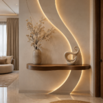
Quick Win: Add one uplight behind a large plant or sculptural object. The shadow play it creates is one of the cheapest ways to add depth to a flat-colored wall.
Small Space Adaptations
Monochrome is one of the best strategies for small living rooms, since it removes the visual “stopping points” that make a space feel chopped up.
- Keep the lightest tone on walls, ceiling, and largest furniture piece to maximize the sense of openness
- Choose furniture with visible legs rather than skirted pieces — it lets light travel underneath and reads as less bulky
- Use one large rug instead of several small ones, sized to sit under the front legs of every seating piece
- Mirror placement matters more here than in any other style — a mirror reflecting a window will visually double the light in a single-color room
Designer Note: In under 150 square feet, avoid your darkest shade on large surfaces entirely. Save it for a single accent — a frame, a vase, a throw pillow — so the room still reads bright and open.
Budget vs. Luxury
| Element | Budget-Friendly Approach | Luxury Approach |
|---|---|---|
| Wall color | Standard matte paint, one shade | Limewash or Venetian plaster finish |
| Sofa | Linen-blend slipcover sofa | Genuine boucle or mohair upholstery |
| Rug | Flatweave or synthetic blend | Hand-knotted wool or silk-blend |
| Lighting | Single floor lamp, warm LED bulb | Layered fixtures with dimmable smart bulbs |
| Accent pieces | Thrifted ceramics in matching tone | Curated vintage or artisan-made objects |
| Textiles | Cotton throws, IKEA-style pillow covers | Hand-loomed wool or Belgian linen |
You don’t need luxury materials to achieve a luxury look. The ratio and lighting matter more than the price tag. A well-lit, well-proportioned budget room will outperform an expensive room with flat lighting every time.
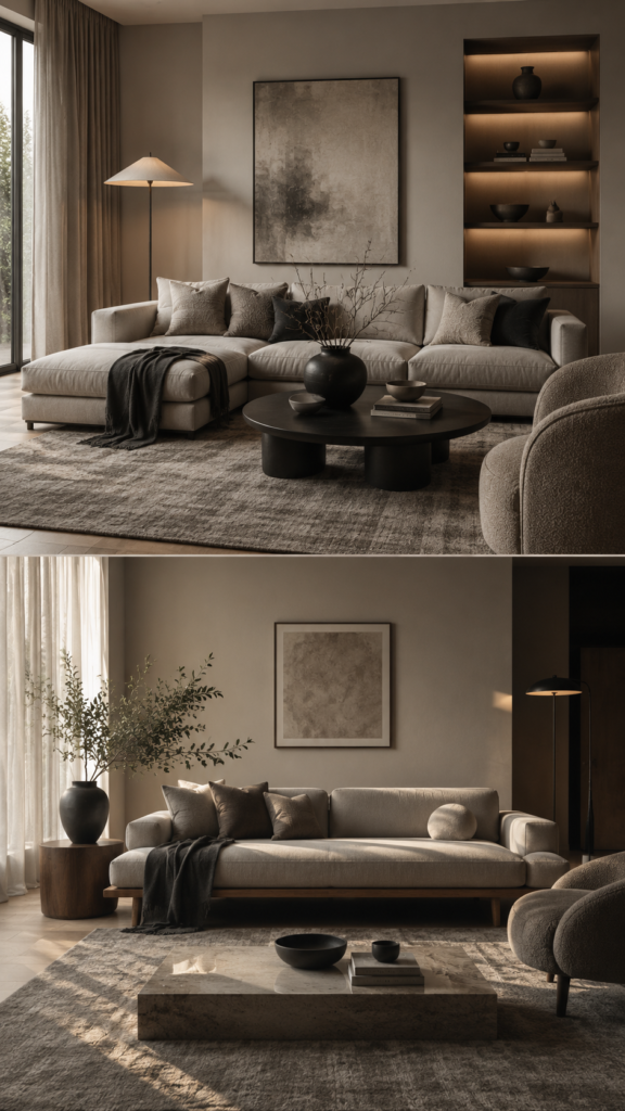
Styling Mistakes to Avoid
Using true black-and-white as your only two tones. This reads as stark rather than sophisticated. Always work in the mid-tones between your lightest and darkest shade.
Matching every fabric exactly. A sofa, rug, and curtains in the identical fabric and shade collapse into one shapeless mass. Vary the fabric type even when the color stays close.
Skipping metal or wood accents entirely. A monochromatic color scheme still needs a neutral material — brass, black iron, or natural wood — to keep it from feeling like a paint swatch come to life.
Forgetting greenery. A single plant in a matching-toned planter softens a monochromatic room instantly and adds a texture no fabric can replicate.
Choosing one shade and stopping there. A room in a single flat tone with no lighter or darker layers is the most common reason monochromatic rooms get called boring.
DIY Improvements
- Dye or slipcover mismatched throw pillows into your chosen palette instead of buying new ones
- Paint a thrifted frame or vase in your darkest accent shade to instantly tie it into the scheme
- Build a gallery of textured wall art — paper, woven fiber, or plaster pieces — all in tonal variations of one color for a custom, expensive-looking focal wall
- Re-cover an old ottoman in a boucle or linen remnant to add texture without buying new furniture
- Layer two rugs — a jute base under a smaller patterned rug in your palette — for depth on a budget
Style Variations
Japandi Monochrome — pairs a warm greige palette with natural wood and minimal accessories for a quiet, grounded feel.
Moody Modern — leans into charcoal and near-black tones with brass accents and dramatic lighting for a nightclub-adjacent living room.
Coastal Cream — an all-ivory-to-sand palette with rattan and linen textures, best in rooms with strong natural light.
Earthy Olive — a sage-to-forest green range layered with terracotta pottery and wood, popular in plant-filled spaces.
FAQ
Does a monochromatic living room feel cold or unwelcoming?
Only if texture and lighting are skipped. A well-layered monochrome room with varied materials and warm lighting feels more inviting than most multicolor spaces.
Can I still add a pop of a second color?
Yes, in small doses. One accent color in under 10% of the room — a single vase or book stack — keeps the palette intentional rather than diluting it.
What’s the easiest color to start with for a first monochromatic room?
Warm greige or taupe. It’s the most forgiving of lighting changes throughout the day and pairs with almost any wood tone.
How many shades of one color should I use?
Three to five, spanning your lightest tint to your darkest shade, is the range most designers work within.
Will a monochromatic room feel dated in a few years?
Less than most trend-driven palettes. Because it relies on tone and texture rather than a specific “in” color, it tends to age gracefully.
A room built on one color asks for more discipline, but it rewards you with a kind of quiet confidence no color-blocked space quite manages