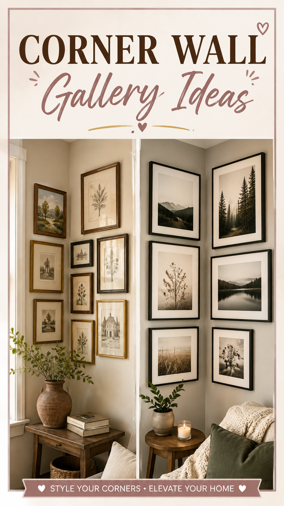
Every home has one. That awkward inside corner where two walls meet and nothing ever seems to fit. A single frame looks lost there. A tall plant leans at a weird angle. Most people just leave it bare and walk past it a hundred times a day without noticing.
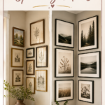
A corner gallery wall turns that dead zone into the most interesting spot in the room. Instead of treating the corner as a limitation, you use the angle itself as part of the design. Frames wrap around the bend, art flows from one wall to the next, and suddenly a space that used to feel unfinished becomes the first thing guests comment on.
This guide breaks down exactly how to plan, arrange, and style a corner gallery wall that looks like it was done by a professional, whether you’re working with a stairwell nook, a living room corner, or an awkward gap beside a window.
Why This Style Works
Corners hold visual weight without needing floor space. In small rooms, that matters. You get a full design feature without sacrificing a single square foot of usable room.
The angle creates natural depth. A flat gallery wall is one plane. A corner gallery wall folds around a 90-degree bend, so the eye reads it as three-dimensional even though every frame is flat.
It solves the “orphan corner” problem. Designers call empty inside corners orphan spaces because they rarely get planned for. Filling one intentionally signals that the whole room was considered, not just the obvious walls.
It works with almost any existing decor. Because the corner is its own contained zone, you can style it in a completely different mood than the rest of the room without anything clashing. A gallery corner in a botanical, black-and-white theme can sit two feet away from a warm wood console and still feel cohesive.
Colour Palette
Corner galleries read best with a controlled palette because the eye is already tracking a more complex shape than a flat wall. Too many colours competing with the angle makes the space feel busy instead of curated.
The 60-30-10 framing formula:
| Percentage | Role | Example |
|---|---|---|
| 60% | Frame finish (dominant) | Black, white, or natural wood frames |
| 30% | Mat and background tone | Cream, warm white, or soft sage mats |
| 10% | Accent pop | One bold print, a gold frame, or a colourful botanical piece |
Stick to one dominant frame colour and let the art carry variation. A wall of ten different frame finishes fights the corner’s natural geometry instead of highlighting it.
Palette pairings that consistently work:
- Black frames + white mats + neutral art for a modern, gallery-museum feel
- Warm wood frames + cream mats + botanical or line art for Scandinavian and Japandi spaces
- Mixed brass and black + jewel-tone prints for a moody, layered look
- All-white frames + black and white photography for a clean, coastal or minimalist result
Layout Tips for the Corner Itself
This is the part most people get wrong, so it’s worth slowing down here.
Start from the corner and work outward. Choose your largest or most important piece and hang it closest to the bend, roughly one to three inches from where the two walls meet. Everything else builds out from that anchor.
Keep the inside edges aligned. The frames’ inner edges (the sides closest to the corner) should follow a consistent line, even if the outer edges stagger at different heights. This is what makes the wall read as intentional instead of accidental.
Mix vertical and horizontal orientations. A corner naturally invites the eye to move up, across, and around. Alternating orientation supports that movement instead of flattening it.
Respect eye level. The visual centre of your grouping should sit around 57 to 60 inches from the floor, which is standard museum height. In a corner, measure this at the midpoint between the two walls, not on each wall separately.
Use the floor-plan trick before you hang anything. Cut paper templates matching each frame size and tape them to the wall in your planned layout. Live with it for a day or two. This single step prevents almost every regret-hole in your wall.
Furniture and Layout Pairing
A corner gallery doesn’t exist in isolation. What sits below or beside it changes how it reads.
Above a corner shelf or reading nook: Keep the gallery lower and denser, since it will be viewed at close range while seated.
Above a corner console or bar cart: Leave more breathing room and let the arrangement climb higher, since it’s typically viewed while standing and walking past.
In a stairwell corner: Follow the angle of the staircase with your frame placement instead of a strict horizontal line. This is one of the only situations where a diagonal arrangement looks deliberate rather than messy.
Beside a window that meets a corner: Let the gallery start a few inches from the window trim and wrap toward the room, using the window light as a natural boundary rather than fighting it.
Lighting for Corner Galleries
Corners often get the least natural light in a room, which can make even a well-planned gallery feel flat.
- Picture lights mounted above the largest frame add warmth without overpowering a small space
- A single floor lamp angled toward the corner creates soft directional light that flatters frame glass without harsh glare
- LED strip lighting tucked behind a floating shelf below the gallery adds a subtle glow that reads as high-end
- Avoid direct overhead spotlights on glass-fronted frames, since they tend to create distracting reflections
Small Space Adaptations
Corner galleries are actually one of the best gallery-wall formats for small rooms, because they use vertical space instead of horizontal footprint.
- Choose 3 to 5 frames instead of 8 to 12. A tighter, well-edited grouping feels intentional in a small room where a sprawling wall would feel crowded.
- Use one shared mat colour to unify smaller frame sizes and make the whole cluster feel like a single piece rather than scattered items.
- Add a narrow floating shelf at the base of the corner to display small objects, which extends the display without adding wall clutter.
- Skip oversized statement pieces in tight corners. A frame larger than about 16×20 inches can overwhelm a narrow inside angle.
Budget vs. Luxury Corner Gallery
| Element | Budget Approach | Luxury Approach |
|---|---|---|
| Frames | Mixed thrifted and big-box frames, unified with spray paint | Custom framing with matching gallery-grade mats |
| Art | Printable digital downloads, personal photos | Original prints, limited-edition photography |
| Lighting | Clip-on picture lights from a home store | Hardwired museum-style picture lights |
| Hanging hardware | Basic nail-in hooks with a level app | Professional installation with laser-guided templates |
| Finishing touch | A single cohesive mat colour throughout | Museum glass to reduce glare and UV fading |
Both routes can look equally polished. The difference is usually in the framing consistency, not the price of the art itself.
Styling Mistakes to Avoid
Ignoring the corner’s natural line. Treating each wall of the corner as a separate gallery, rather than one continuous composition, is the single most common mistake.
Overcrowding the bend. The two or three frames closest to the corner need slightly more breathing room than frames elsewhere, since the angle already adds visual complexity.
Using frames that are too shallow or too deep. Very thin frames can look flimsy against a strong corner angle, while very deep shadow-box frames can catch dust and shadow awkwardly in a tight space.
Hanging everything at the same height. A row of frames marching in a perfectly straight line loses the organic feel that makes corner galleries interesting in the first place.
Forgetting to measure both walls. Corners are rarely perfectly symmetrical. Measure each wall of the angle separately before finalizing your layout.
DIY Improvements
- Paint the corner a slightly deeper shade than the surrounding walls to create a subtle backdrop that makes the frames pop without a full accent wall commitment
- Build a simple floating corner shelf from a single wood board and two L-brackets to add a display ledge beneath the gallery
- Create your own mats from mat board and a craft knife to get a perfectly unified look without paying custom framing prices
- Repurpose old frames with a coat of matte spray paint in one unified colour for an instant designer look at a fraction of the cost
Style Variations
Modern Minimalist: Black frames only, generous white space between pieces, black-and-white photography or line art.
Japandi: Natural wood frames, muted botanical prints, one ceramic or woven object mounted alongside the flat art.
Farmhouse: Mixed white and weathered wood frames, vintage-style prints, a small corner shelf with a stack of books or a pitcher of dried florals.
Boho: Woven wall hangings mixed with framed prints, warm terracotta and brass tones, asymmetrical spacing that feels collected over time rather than planned in one afternoon.
Luxury Eclectic: A mix of frame finishes unified by consistent matting, one oversized statement piece anchoring the corner, layered lighting.
FAQ
How many frames do I need for a corner gallery wall? Most corner galleries work well with 5 to 9 pieces. Fewer than 5 can feel sparse given the added visual interest of the angle, while more than 9 in a tight corner risks feeling cluttered.
Should frames actually touch at the corner? No. Leave 2 to 4 inches of space at the point where the two walls meet so the arrangement doesn’t feel jammed into the angle.
Can I do a corner gallery wall with only photos, no art? Yes. Photo-only corner galleries work especially well in hallways and stairwells. Keep frame styles consistent so the personal photos feel curated rather than random.
What’s the best frame size to start with in a corner? Start with a mid-size piece, around 11×14 to 16×20 inches, placed closest to the corner. It’s large enough to anchor the composition without overwhelming the angle.
Does a corner gallery wall work in a rental? Yes, using removable adhesive strips rated for frame weight, or a leaning ledge shelf setup that avoids nail holes entirely.
A corner gallery wall is proof that the most overlooked part of a room can become its best feature. Give the angle a little intention, and it stops feeling like empty space and starts feeling like the reason the room works.