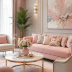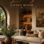
Pastels get dismissed as childish more often than they deserve. Painted the wrong way, sure, a pastel room can drift toward a nursery. Painted the right way, it becomes one of the most quietly expensive-looking palettes in interior design.
The trick is treating pastel as a sophisticated neutral rather than a candy color. Think chalky sage, dusty rose, warm oat, and soft dove grey, dressed in rich materials and grounded with deeper accent tones. That combination is what separates a luxury pastel living room from a pastel nursery that grew up too fast.
This guide walks through how to build that look in your own space, from color ratios to furniture choices to the small styling mistakes that flatten the whole effect.
Why This Style Works
Soft pastels read as luxurious because they borrow a trick from high-end hospitality design: low contrast, high texture.
Muted colors let materials do the talking. When a wall isn’t shouting for attention, your eye moves to the boucle on the sofa, the brass on the lamp, the veining in a marble tabletop.
Pastel tones reflect light beautifully. Soft hues bounce daylight around a room rather than absorbing it, which makes spaces feel airier and larger, a quality luxury interiors lean on constantly.
The palette photographs and lives calmly. Unlike saturated color trends that date quickly, dusty pastels paired with warm neutrals have shown remarkable staying power across the last several design cycles.
It reads as intentional, not accidental. A true pastel-luxury room requires real restraint. That restraint itself signals design confidence, the same way a minimalist wardrobe signals someone who knows exactly what they like.
Colour Palette
The formula that keeps a pastel living room from tipping into overly sweet is a 70/20/10 ratio.
| Ratio | Role | Example Tones |
|---|---|---|
| 70% | Base neutral | Warm white, oat, soft dove grey |
| 20% | Pastel accent | Dusty rose, sage, powder blue, lilac |
| 10% | Grounding contrast | Espresso wood, black metal, deep emerald |
Choose one dominant pastel, not three. A single hero tone, say dusty rose, layered in a few different shades feels curated. Three competing pastels start to feel like a paint chip display.
Anchor with a deep, non-pastel accent. This is the step most amateur pastel rooms skip. A charcoal frame, black iron lamp, or espresso coffee table keeps the palette from floating away into weightlessness.
Warm undertones age better than cool ones. Pastels with a beige or peach base (warm dusty rose, buttery cream) tend to feel timeless, while very cool pastels (icy lilac, baby blue) can drift toward retro-nursery territory faster.
Test paint under both daylight and lamp light. Pastels shift dramatically between morning light and evening lamps; what reads as elegant taupe-pink at noon can look distinctly bubblegum under warm bulbs.
Furniture and Layout
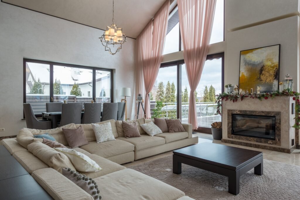
Furniture is where the luxury half of this equation actually gets built. Pastel color plus budget furniture reads cheap. Pastel color plus considered pieces reads expensive.
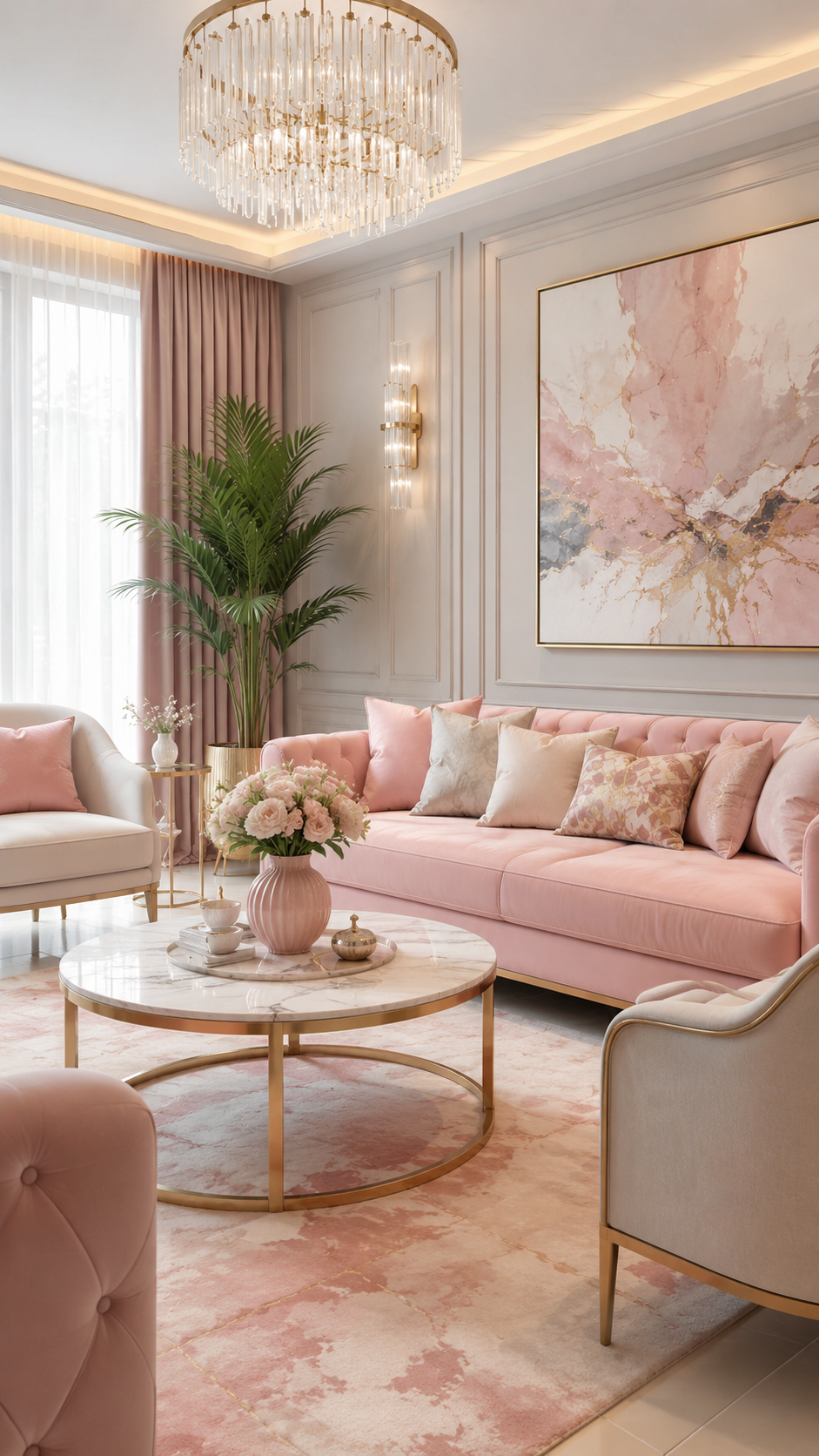
Invest in one substantial upholstered anchor piece. A boucle or velvet sofa in a muted rose or sage is the single item that will define whether the room feels elevated. This is worth spending on even if you save elsewhere.
Mix material weight deliberately. Pair the soft upholstery with something hard and cool, marble, fluted glass, brushed brass, or lacquered wood. That contrast in texture is what luxury interiors rely on more than color itself.
Choose curved silhouettes over sharp ones. Rounded arms, curved backs, and organic coffee table shapes soften the pastel palette further without pushing it into whimsical territory.
Keep the layout symmetrical and generous. Luxury spaces tend to avoid clutter. Leave breathing room around each furniture grouping, and favor a balanced, centered arrangement over an asymmetrical, maximalist one.
Layer in metallics sparingly. Aged brass, warm gold, or brushed bronze hardware and lighting fixtures add the glint that keeps a soft palette from feeling flat.
Lighting
Lighting has an outsized effect on pastel tones specifically, since these colors are so sensitive to temperature and intensity.
Prioritize warm white bulbs, 2700K–3000K. Cooler bulbs can wash pastels out and make them look institutional rather than inviting.
Layer three light sources minimum. Combine ambient (a statement chandelier or flush mount), task (a floor or table lamp), and accent (picture lights or a dimmer-controlled wall sconce).
A sculptural chandelier does double duty. In a pastel room, the light fixture often becomes the room’s jewelry. A fluted glass or aged-brass fixture adds the visual weight the soft palette needs overhead.
Dimmers are non-negotiable for evening luxury. Soft colors under harsh, flat light lose their richness fast. A dimmer switch lets the same room shift from bright and airy by day to warm and moody by night.
Small Space Adaptations
A soft pastel palette is actually one of the more forgiving choices for compact living rooms, since light tones expand a space visually.
Use pastel on walls, not just accents, in tight rooms. A full wash of one soft tone (walls, trim, even ceiling) removes visual breaks that make small rooms feel choppy.
Choose furniture with visible legs. Sofas and chairs that show a sliver of floor beneath them keep a small pastel room feeling light rather than heavy.
Mirror the window wall. A large mirror opposite the main window doubles the natural light bouncing off your pastel surfaces, amplifying the airy effect the palette is known for.
Skip the busy area rug. In a small space, a solid or subtly textured rug in a tone-on-tone pastel keeps the floor from competing with the walls.
Budget vs. Luxury
| Element | Budget Approach | Luxury Approach |
|---|---|---|
| Sofa | Linen-blend slipcover in dusty rose | Boucle or velvet upholstery, tailored fit |
| Coffee Table | Painted wood in matching pastel | Marble top with brass or black metal base |
| Lighting | Single flush-mount fixture | Layered chandelier plus dimmable sconces |
| Wall Treatment | Flat matte paint | Limewash or Venetian plaster finish |
| Accents | Mixed throw pillows | Curated vases, one statement art piece, brass trays |
| Rug | Solid pastel synthetic blend | Hand-knotted wool in tonal pastel weave |
Both columns can produce a genuinely elegant room. The luxury column simply trades a few budget-friendly swaps for material upgrades in the pieces that get touched and seen most, upholstery, tabletops, and light fixtures.
Styling Mistakes to Avoid
Using more than one pastel at equal strength. Competing pastels with no clear hierarchy make a room feel like a paint sample wall rather than a designed space.
Skipping the dark grounding accent. Without at least one deep, saturated element, an all-pastel room can feel washed out and flat instead of serene.
Matching too perfectly. A sofa, curtains, and rug in the exact same shade of pink reads as a set rather than a curated room. Vary the pastel’s saturation and pairing across pieces.
Choosing glossy, cheap-feeling fabrics. Shiny polyester upholstery in a pastel tone can look inexpensive fast. Matte, textured fabrics like boucle, linen, and velvet carry the luxury feel far better.
Overlighting with cool bulbs. Cool white or daylight bulbs flatten pastel warmth and can make the whole room feel clinical rather than cozy.
DIY Improvements
Limewash an accent wall. A DIY limewash finish in a soft sage or blush adds handmade texture and depth that flat paint can’t replicate, and it’s a weekend-sized project.
Reupholster a thrifted chair. A secondhand chair frame with good bones, reupholstered in a muted velvet, often looks more expensive than a new budget piece.
Update hardware and switch plates. Swapping builder-grade white switch plates and cabinet hardware for aged brass is a low-cost change that elevates the whole room’s finish level.
Build a simple picture ledge. A floating wood ledge painted to match your trim gives you a flexible, gallery-style spot for rotating art without committing to permanent frame placement.
Style Variations
Pastel Japandi. Pair soft sage or oat tones with natural wood, low-profile furniture, and minimal accessories for a calmer, more pared-back version of this look.
Pastel Art Deco. Lean into fluted glass, brass fan shapes, and a bolder jewel-tone accent alongside your pastel base for a glamorous, 1920s-inflected take.
Pastel Farmhouse. Combine dusty blue or sage with shiplap, linen slipcovers, and vintage wood pieces for a softer, more lived-in country feel.
Pastel Maximalist. For those who want more energy, layer multiple pastel patterns (florals, checks, stripes) against a neutral base, then anchor with dark wood furniture to keep it grounded.
FAQ
Will a pastel living room feel too feminine? Not if it’s balanced with structural, masculine-leaning elements: black metal frames, dark wood, and matte textures. The palette itself is gender-neutral; it’s the accessories that usually tip a room in one direction.
What wall color pairs best with pastel furniture? A warm off-white or soft greige wall lets pastel furniture stand out as the accent color, which is often more flattering than painting the walls the same pastel tone as the sofa.
How do I keep a pastel room from looking dated in a few years? Stick to warm-toned pastels over cool ones, invest in timeless furniture silhouettes, and treat trend-driven pieces (like a specific accent chair shape) as swappable rather than structural.
Can pastel work in a north-facing room with less natural light? Yes, but lean warmer. Dusty rose, warm sage, and buttery cream hold up better than cool lilac or icy blue in rooms with limited direct sun.
Is this palette pet and kid friendly? Choose performance fabrics in your chosen pastel tone; many boucle and velvet alternatives are now stain-resistant, so you don’t have to sacrifice the look for durability.
A pastel living room done well doesn’t announce itself. It just feels calm, considered, and a little more expensive than it actually cost.