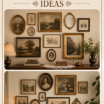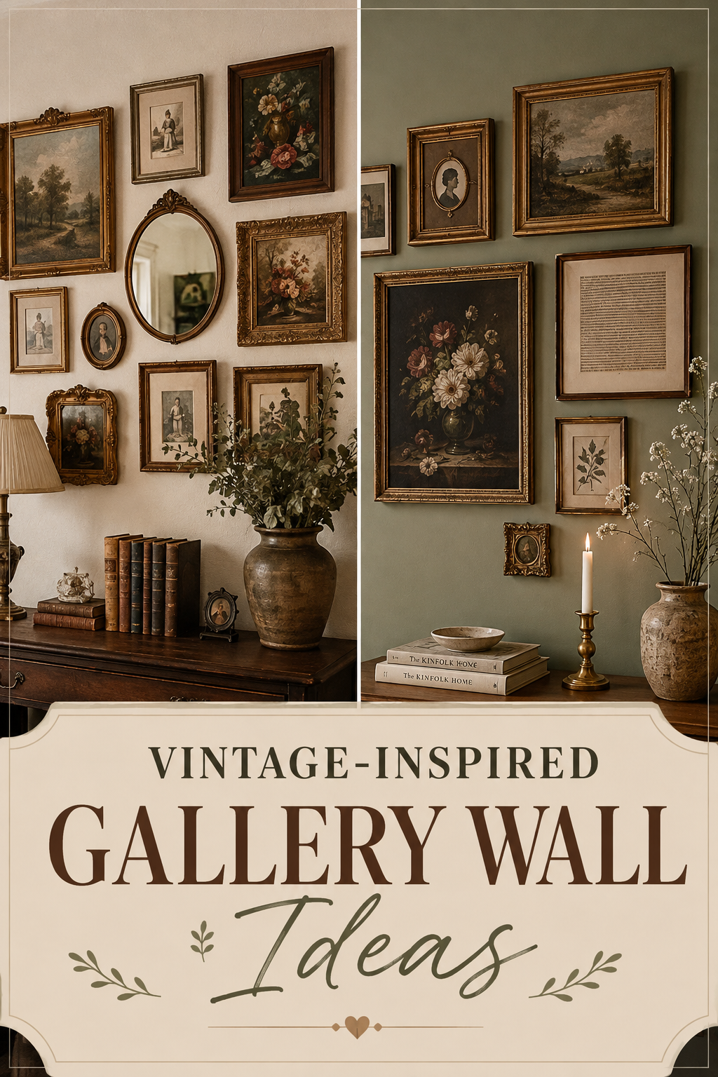
A vintage gallery wall doesn’t look planned. It looks like it happened over decades.
That’s the whole trick. Mismatched frames, aged brass, a few chipped edges — these aren’t flaws, they’re the point. A wall like this tells you the room belongs to someone who’s lived a little, traveled a little, and kept the things that mattered.
Below is a full breakdown of how to build one that reads as authentic rather than staged, from the palette down to the last nail hole.
Why This Style Works
Vintage gallery walls succeed because they reject the matched-set instinct most of us default to.
Perfection reads as cold. A wall of identical black frames, evenly spaced, feels like a hotel lobby. A wall of brass, walnut, and chipped gilt — hung slightly off-grid — feels like a home.
This style also solves a real decorating problem: what to do with art and objects collected over years that don’t “match.” A vintage gallery wall doesn’t need them to match. It needs them to relate — through color, era, or subject.
Three reasons this approach holds up:
- It ages well instead of looking dated in five years, because it was never chasing a trend
- It works with pieces you already own, so the cost stays flexible
- It gives a room a sense of history even if the house is brand new
Colour Palette
Vintage gallery walls live or die on their palette. Too many competing tones and the wall turns into noise.
The safest approach: pick one dominant undertone — warm or cool — and let 80% of your pieces sit within it.
| Palette | Frame Tones | Best Wall Colour | Mood |
|---|---|---|---|
| Warm Antique | Brass, walnut, gold leaf | Cream, terracotta, warm white | Cozy, lived-in |
| Faded Botanical | Aged bronze, sage-painted wood | Soft sage, dusty olive | Quiet, garden-like |
| Monochrome Vintage | Black, tortoiseshell, dark oak | Off-white, greige | Editorial, moody |
| Romantic Pastel | Chipped white, dusty rose, pewter | Blush, soft grey | Feminine, delicate |
Quick Win: if you’re unsure where to start, pull your palette from one anchor piece — an old oil painting, a faded map, a family portrait — and build the rest of the wall around its colors.
Frame and Object Ideas
A vintage wall isn’t only picture frames. That’s the biggest mental shift to make before you start hanging anything.
Strong additions beyond framed art:
- Ornate mirrors in tarnished gold or aged silver
- A small collection of hand-painted plates
- Botanical or scientific prints in mismatched wood frames
- An antique clock face or a piece of salvaged architectural trim
- Needlepoint or embroidery hoops in worn frames
- A vintage postcard or letter, matted and framed
Where to actually find these pieces:
- Estate sales, which tend to have the best frame variety for the lowest price
- Flea markets, especially for mirrors and plates
- Secondhand shops, for empty frames you can fill yourself
- Family boxes in storage — old photos and letters count
The goal is a wall that couldn’t be recreated by walking into a single store and buying a set.
Layout Tips
Vintage walls read best when they follow an organic shape rather than a strict grid.
The paper-template method works every time:
- Trace each frame onto kraft paper and cut it out
- Tape the paper shapes to the wall and rearrange until the spacing feels right
- Mark the hanging points through the paper
- Remove the paper and hang the real frames on the marks
Three layout shapes that suit this style:
- The Salon Cluster — frames stacked close together, edges nearly touching, in an irregular block. This is the classic “collected over time” look.
- The Loose Grid — a rough grid with 2–3 inches between frames, but sizes varied so it doesn’t feel rigid.
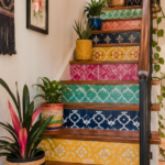
- The Staircase Trail — frames following a staircase or hallway at ascending heights, ideal for narrow spaces.
Keep the largest, boldest piece slightly off-center rather than dead-middle. Centered symmetry works against the antique, gathered-over-time feeling you’re going for.
Lighting
Vintage pieces, especially anything with a patina or gilt finish, respond beautifully to warm, low light.
What actually flatters aged frames:
- Picture lights mounted directly above statement pieces, in an aged brass finish to match
- Warm bulbs (2700K or lower) instead of daylight-toned LEDs
- A nearby floor lamp with a fabric shade, casting soft ambient light across the wall rather than a single spotlight
Avoid bright overhead lighting pointed straight at the wall. It flattens texture and makes aged finishes look dull instead of rich.
Designer Note: if the wall sits in a hallway with no natural light, a single warm picture light on a timer will do more for the vintage mood than any amount of overhead lighting.
Small Space Ideas
Vintage gallery walls scale down easily, which makes them a strong choice for apartments, rentals, and narrow hallways.
- Stairwell walls hold a long, ascending trail of small frames without eating into floor space
- Above a headboard works when you keep frames light — command strips can hold anything under a pound
- A single door frame surround, where small pieces wrap the sides of a doorway instead of spreading across an entire wall
- Bathroom walls, using only glass-front frames or sealed prints to handle humidity
For rentals, adhesive hooks rated for picture frames let you build the full salon-cluster look without a single nail hole.
Budget Options vs Luxury Alternatives
You can build this look at almost any price point. The frames matter more than the art inside them.
| Element | Budget Approach | Luxury Approach |
|---|---|---|
| Frames | Thrifted, spray-painted to unify finish | Original antique frames from estate sales |
| Art | Free vintage images printed at home, then aged with tea-staining | Original oil paintings or signed prints |
| Mirrors | Secondhand mirrors, resprayed in gold | Restored antique mirrors with original glass |
| Hanging hardware | Basic picture hooks | Museum-grade wall wire and brass hooks |
Budget hack: buy mismatched frames in any finish, then unify them with the same spray paint color. This single step makes a $5 flea-market frame look like it belongs next to a $200 antique one.
Styling Mistakes to Avoid
Even a great collection of pieces can fall flat if the wall itself is put together wrong.
- Hanging everything at the same height. This flattens the collected-over-time feeling the style depends on.
- Using frames that are all the same finish. A wall of identical gold frames reads as a matched set, not a vintage find.
- Overcrowding without a breathing point. Every salon wall needs at least one slightly larger, simpler piece to give the eye a place to rest.
- Skipping the paper-template step. Guessing spacing directly on the wall almost always leaves uneven nail holes and an off-balance final layout.
- Choosing frames that are too new-looking. A crisp, glossy black frame next to worn brass breaks the illusion immediately.
Maintenance Note: dust framed glass and mirror surfaces monthly with a dry microfiber cloth. Avoid glass cleaner directly on aged gilt frames — the moisture can lift old gold leaf.
DIY Improvements
A few small techniques can turn ordinary finds into pieces that look decades older than they are.
- Tea-stain paper prints to give modern reproductions an aged, warm tone
- Rub dark wax into carved wood frames to deepen the grooves and mimic decades of handling
- Distress new frames with light sanding along the edges, then a thin coat of dark glaze wiped back
- Age brass hardware with a mix of vinegar and salt, left on for a few minutes, then rinsed
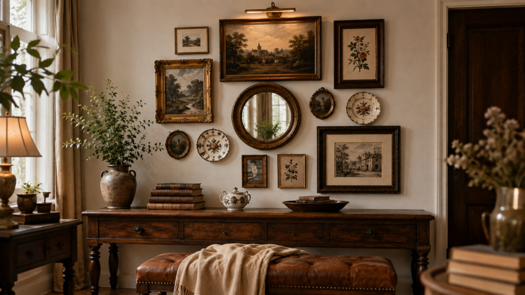
None of these require special tools — most can be done on a kitchen table in under an hour per frame.
FAQ
How many pieces do I need to start a gallery wall? Six to eight is enough to establish the look. You can keep adding pieces over months, which actually strengthens the vintage, gathered-over-time effect.
Do all the frames need to be antique? No. A mix of two or three genuinely old pieces alongside newer frames painted or distressed to match reads just as authentic, and costs far less.
What wall works best for this style? Stairwells, hallways, and the wall behind a sofa are the three strongest spots, since they give enough length for an organic, irregular layout.
How do I keep it from looking cluttered? Leave at least one larger, quieter piece in the mix, and keep the spacing between frames consistent even if the frame styles vary.
Can I do this in a rental? Yes. Adhesive picture-hanging strips rated for the frame weight let you build the full look without any wall damage.
Some walls decorate a room. This one tells its story.