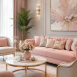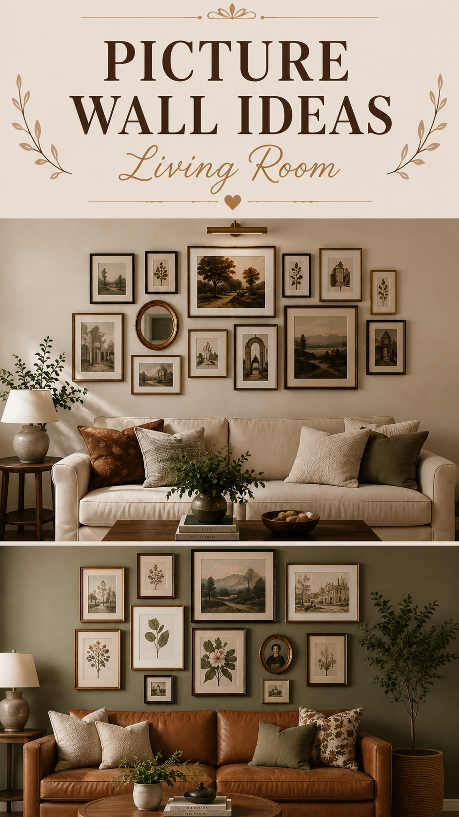
A blank wall behind the sofa is one of the most wasted spaces in a living room. A well-planned picture wall fixes that instantly — it adds personality, scale, and a focal point that photos alone rarely deliver.
This guide walks through layout styles, spacing rules, lighting, styling mistakes, and budget-to-luxury options so you can build a picture wall that looks intentional, not accidental.
Why a Picture Wall Still Earns Its Place
Open shelving trends come and go, but a picture wall solves a problem that never goes away: large, empty vertical space.
A sofa, console, or media unit only fills the bottom third of a wall. Everything above it needs a plan, or the room reads unfinished.
Three things a picture wall does that single art pieces can’t:
- Fills scale without needing one oversized (and expensive) piece
- Layers in personal history — travel prints, family photos, sketches — without looking like a scrapbook
- Draws the eye upward, which makes ceilings feel taller in average-height rooms
Designer Note: A picture wall is one of the few decor moves that gets more interesting with age. Add a piece a year and it evolves with the room instead of going stale.
Pick a Layout Style First — Not the Frames
Most picture walls fail because people choose frames before they choose a layout logic. Pick the structure first.
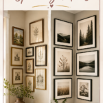
1. The Grid Equal-sized frames, equal spacing, aligned in rows and columns. Best for modern, minimalist, and Scandinavian rooms where order matters more than variety.
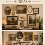
2. The Salon Wall Mixed frame sizes, finishes, and even mediums (mirrors, small shelves, art) clustered with no strict alignment. Suits Boho, Farmhouse, and Eclectic-Traditional spaces.
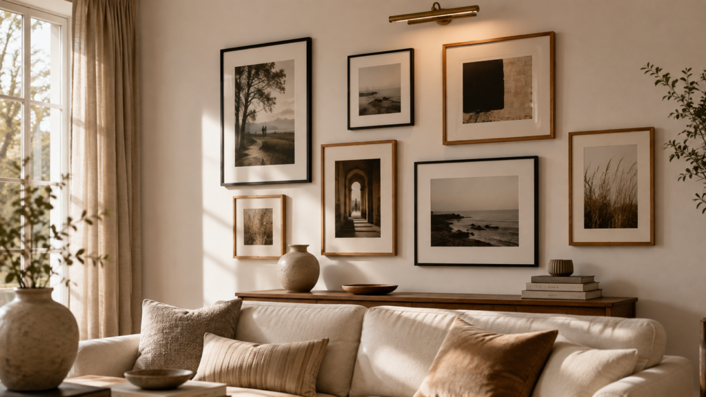
3. The Linear Row A single horizontal line of same-height frames, usually 3 to 7 pieces. Works well above a low console or a long sofa back.
4. The Asymmetrical Cluster Varied sizes arranged around a visual center of gravity, without a grid. This is the hardest to get right but the most editorial-looking when it works.
| Layout | Best For | Difficulty |
|---|---|---|
| Grid | Modern, Japandi | Easy |
| Salon Wall | Boho, Farmhouse, Traditional | Hard |
| Linear Row | Transitional, Small walls | Easy |
| Asymmetrical Cluster | Contemporary, Luxury | Medium |
Colour Palette and Frame Finishes
Pick one frame finish family and stay in it. Mixing warm wood, black metal, and gold at random is the fastest way to make a wall feel cluttered instead of curated.
Reliable finish pairings:
- Black metal + white mats — crisp, modern, works with almost any wall colour
- Warm oak + linen mats — Scandinavian and Japandi living rooms
- Antique gold + mixed neutrals — Traditional and Luxury spaces
- Mixed matte black and warm wood (max two finishes) — Boho and Eclectic rooms
For the wall colour itself, picture walls read best against matte, mid-to-light neutrals — warm white, greige, soft sage, or clay. High-gloss or very dark walls can work, but they demand simpler, more spaced-out layouts so the wall doesn’t compete with the art.
The Spacing Formula Nobody Explains Properly
Most picture walls look “off” for one reason: inconsistent spacing. Use this formula and the eye stops noticing gaps.
The 2–3 inch rule:
- Leave 2 to 3 inches between frames in a grid or linear layout
- For salon-style clusters, keep a minimum of 2 inches between any two frame edges, even at their closest point
- Measure from frame edge to frame edge, never from the center of the frame
- Keep the same gap throughout the entire wall — one consistent number, not “roughly”
Centering height: the middle of the arrangement should sit at eye level, generally 57 to 60 inches from the floor to the center of the grouping — the same standard museums use.
Quick Win: Before hammering a single nail, trace each frame onto kraft paper, cut it out, and tape the paper templates to the wall. Move paper, not holes.
Lighting Makes or Breaks the Wall
A picture wall lit only by overhead ceiling light goes flat and shadowy by evening — exactly when most people are using the living room.
Layer at least two light sources:
- A picture light or slim LED bar mounted above the arrangement, angled down
- A floor or table lamp nearby to soften shadows and add warmth at night
- Natural light from the side (not directly opposite) enhances texture on textured frames and canvases without glare
Avoid placing a picture wall directly across from an uncovered window — direct sun fades prints and photos within a couple of years.
Furniture and Layout Pairing
The furniture below the wall should visually “hold” the arrangement, not float beneath it.
- Behind a sofa: keep the total width of the picture wall close to the width of the sofa, give or take a few inches on each side
- Above a console or media unit: the arrangement can extend slightly wider than the furniture, since the eye reads it as one grouped element
- On its own wall with no furniture below: center the arrangement on the wall itself, not on any nearby door or window
Common Styling Mistakes to Avoid
Hanging everything too high. This is the single most common error — frames get hung at “average eye level while standing,” which is too high for a wall people mostly view while seated.
Using frames that are all the same size. Even in a grid layout, a little size variation (two sizes, not five) keeps it from feeling like a spreadsheet.
Ignoring the mat. A mat that’s too narrow makes small art look cramped; too wide and it swallows the piece. 2 to 3 inches is the safe range for most frame sizes.
Ignoring the furniture scale. A tiny cluster of 4×6 frames above a large sectional reads as an afterthought, not a feature.
Forgetting depth. A wall of only flat framed prints can look one-dimensional. Adding one shelf, mirror, or dimensional object breaks it up.
Budget vs. Luxury Picture Wall
| Element | Budget Approach | Luxury Approach |
|---|---|---|
| Frames | Mixed thrifted and big-box frames, repainted to match | Custom framing with matching moulding profile |
| Art | Printable digital art, personal photos, postcards | Original works, limited-edition prints |
| Layout | DIY paper-template grid | Professionally installed gallery wall |
| Lighting | Plug-in picture light | Hardwired, dimmable art lighting |
| Finishing touch | Uniform spray paint on mismatched frames | Museum-grade UV glass |
Both approaches can look equally intentional — the difference is in the planning, not the price tag.
Small Living Room Ideas
Small rooms benefit from picture walls more than large ones, as long as scale is controlled.
- Stick to one wall. Splitting art across two walls in a small room fragments the space
- Vertical clusters (taller than wide) draw the eye up and make low ceilings feel higher
- Keep frame count under 9 in rooms under roughly 150 square feet — more than that reads as busy in a tight footprint
- Mirror pairing: swapping one or two frames for small mirrors bounces light and adds the illusion of depth without adding visual weight
DIY Improvements Worth Doing
- Repaint mismatched thrifted frames in one unifying colour before hanging — this single step does more than any other budget upgrade
- Add mat board to oddly-sized prints so they fit standard frame sizes without custom cutting
- Swap glass for museum glass on any piece that faces natural light, to prevent fading
- Build a simple picture ledge from a painted shelf board — it lets you rearrange art without new nail holes, which is ideal for renters
FAQ
How many frames should a picture wall have? Anywhere from 3 to 15, depending on wall size and layout style. Salon walls tend toward the higher end; grids and linear rows usually sit between 4 and 9.
What height should a picture wall start at? For arrangements above a sofa, leave 6 to 8 inches between the top of the sofa back and the bottom of the frames.
Can I mix photos and art on the same wall? Yes, as long as the frame finishes stay consistent. Mixed frame colours alongside mixed content types tends to look chaotic.
Do I need to hang everything permanently? No. Picture ledges and adhesive hanging strips let the arrangement change over time without commitment.
What’s the safest layout for a first attempt? The linear row. It has the fewest variables to get wrong and still looks deliberate.
A picture wall is never really finished — it just keeps telling the room’s story as it grows.