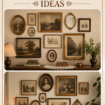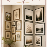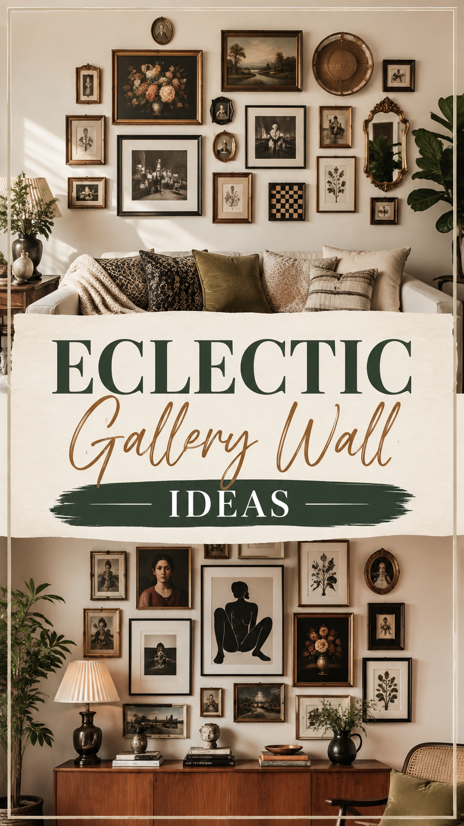
An eclectic gallery wall is the one decor move that turns a blank hallway or a sad stretch of staircase into the most interesting part of the house. It’s not about matching frames or symmetrical grids. It’s about collecting pieces that mean something to you and hanging them so the wall tells a story.
Done well, it reads as curated and personal. Done carelessly, it can tip into visual noise fast. This guide walks through exactly how to get the eclectic look right — from planning the layout to picking a palette that keeps everything cohesive, even when nothing technically “matches.”
Why This Style Works
People are drawn to walls that feel lived-in. A single oversized art print looks polished, but it doesn’t say much about who lives there. A gallery wall built from flea market finds, family photos, and mismatched frames does.
Asymmetry reads as confidence, not chaos. A grid layout signals “I followed a template.” An eclectic arrangement signals “I made choices.” That’s the entire appeal — it looks intentional even when the individual pieces are wildly different in size, era, and medium.
It solves an awkward wall problem. Staircases, long hallways, and the space above a console table are notoriously hard to decorate with a single piece of art. A gallery wall fills the space without requiring one perfectly proportioned statement piece.
It’s endlessly editable. Unlike a matched art set, an eclectic wall can grow. Add a new frame from a trip, swap out a print that’s stopped feeling right, tuck in a small mirror. The wall keeps evolving with the room.
Layout Tips: Getting the Arrangement Right
This is where most eclectic gallery walls succeed or fail. The trick isn’t avoiding structure — it’s building in just enough structure that the eye has somewhere to rest.
Start on the floor, not the wall. Lay every piece out on the floor first, arranged the way you’re considering hanging them. This lets you shuffle without a hammer and nails involved, and you’ll catch spacing problems early.
Anchor with one or two large pieces. Pick your biggest frame or artwork and treat it as the visual anchor. Build the smaller pieces around it rather than scattering everything at the same scale, which is what makes a wall feel busy instead of curated.
Keep spacing consistent, even if sizes aren’t. Leave roughly 2–3 inches between frames throughout the arrangement. Uneven gaps are one of the fastest ways to make an intentional layout look accidental.
Work in a loose invisible shape. Most successful eclectic walls follow a rough rectangle, oval, or organic cluster shape, even though the individual frames vary. Tape off the outer boundary on the wall with painter’s tape before you start hanging.
Mix orientation sparingly. A few vertical pieces next to horizontal ones adds movement. Too many competing orientations makes the eye dart around without landing anywhere.
Use paper templates. Trace each frame onto kraft paper, cut it out, and tape the templates to the wall in your planned layout. Step back, adjust, and only then start hammering nails through the paper markers.
Colour Palette: The Secret to Making Mismatched Pieces Cohere
An eclectic wall doesn’t need matching frames, but it does need a unifying thread — and color is the easiest one to control.
Pick a dominant frame tone. Choose one wood tone or metal finish — walnut, black, brushed brass — and use it for 60-70% of your frames. The remaining frames can be different finishes, and the wall will still feel connected.
Let the art carry a limited palette. Even with wildly different subjects, art that shares two or three recurring colors will read as a set. A botanical print, an abstract painting, and a black-and-white photo can sit together beautifully if a rust or sage tone threads through a few of them.
Neutral walls make eclectic art louder. A white or soft greige wall gives busy, colorful art room to breathe. On a saturated or dark wall, choose art with higher contrast so individual pieces don’t disappear into the background.
Consider a color-story table before you commit:
| Wall Color | Best Frame Tones | Best Art Palette |
|---|---|---|
| Warm white | Black, walnut, brass | Earthy tones, muted brights |
| Soft sage or olive | Natural wood, matte black | Terracotta, cream, ochre |
| Charcoal or deep navy | Brass, gold, white | High-contrast prints, botanical line art |
| Terracotta or clay | Black, aged bronze | Cream, sage, dusty blue |
Designer Note: If you’re nervous about color clashing, pull your palette from a single textile in the room — a rug, a throw pillow, curtains — and echo two of its colors somewhere in the wall. It ties the gallery back into the room instead of letting it float as a separate element.
Lighting: Don’t Let a Great Wall Sit in Shadow
Picture lights change everything. A slim brass or black picture light mounted above a central piece adds a warm glow at night and signals “gallery,” not just “wall of frames.”
Layer in ambient light from the side. A floor lamp or wall sconce positioned to one side of the arrangement casts soft shadows that add depth, especially with textured or 3D pieces like woven wall hangings or ceramic plates.
Avoid direct overhead spotlighting on glass-framed pieces. Glare washes out the art and creates a distracting hot spot. Angle any overhead lighting so it grazes the wall rather than hitting it head-on.
Natural light is your best editor. Walk past the wall at different times of day before finalizing placement. A spot that looks fine at noon can go flat and shadowy by evening, which affects how balanced the whole arrangement reads.
Furniture and Styling Pairings
Anchor the wall with a piece of furniture below it. A console table, bench, or the back of a sofa gives the eye a stopping point and keeps the gallery from feeling like it’s floating mid-wall.
Leave 6-8 inches between furniture and the lowest frame. Too tight, and the wall competes visually with what’s on the table below. Too loose, and the two elements stop reading as a pairing.
Add one dimensional object into the mix. A small woven basket, a ceramic plate, or a slim wall-mounted shelf holding a single vase breaks up the flatness of an all-frame wall and reinforces the eclectic, collected feeling.
Small Space Ideas
Go vertical instead of wide. In a narrow hallway or stairwell, stack the arrangement in a tall column rather than spreading it horizontally. This uses height most homes have plenty of, without eating into walking clearance.
Use a single wall as the “gallery zone.” In small rooms, resist the urge to spread art across every wall. One dedicated gallery wall reads as a design choice; art scattered thinly across every surface reads as clutter.
Choose fewer, smaller frames. A tight cluster of 5×7 and 8×10 frames fills a small wall without overwhelming it the way a few oversized pieces would in a tight room.
Mirrors do double duty. Include one small mirror in the arrangement. It adds visual variety and bounces light back into the room, which matters more in compact spaces than almost anywhere else.
Budget Options vs. Luxury Alternatives
| Element | Budget Approach | Luxury Approach |
|---|---|---|
| Frames | Thrifted or discount-store frames, spray-painted to match | Custom framing with museum glass and matched moulding |
| Art | Printable digital downloads, personal photography | Original prints, limited-edition works, gallery pieces |
| Hanging hardware | Command strips or basic picture hooks | Professional wall-mounted rail systems |
| Lighting | Plug-in picture light | Hardwired, dimmable gallery lighting |
| Extras | Flea market finds, pressed botanicals | Curated objects from art fairs or estate sales |
Quick Win: Buy five to seven frames in the same finish from a discount retailer, then fill them with a mix of printed art, personal photos, and one botanical print. The uniform frame finish does most of the “expensive-looking” work for a fraction of the cost.
Common Styling Mistakes to Avoid
Hanging everything at the same height. This creates a rigid, grid-like feel that fights against the eclectic look you’re going for.
Skipping the planning stage. Nailing frames up one at a time without a plan almost always leads to a lopsided, patchy result and a wall full of extra nail holes.
Using too many different frame colors. Three or more competing metal and wood tones in one small area reads as disorganized rather than curated.
Hanging art too high. The visual center of the arrangement should sit around eye level, roughly 57-60 inches from the floor — not several inches above where most people naturally look.
Filling every inch of the wall. Leaving some breathing room around the outer edge of the arrangement keeps it feeling like a considered composition rather than a wall that ran out of space.
Maintenance Note
Dust frames and glass every couple of weeks with a microfiber cloth, and check picture wire or hooks every few months — frames shift slightly over time, especially in homes with foot traffic or vibration from nearby doors. Rotate one or two pieces seasonally to keep the wall feeling current without redoing the whole layout.
DIY Improvements to Personalize the Wall
Spray-paint mismatched frames one unifying color. This is the single fastest way to make a thrifted collection look intentional.
Frame something unexpected. Pressed leaves, a piece of fabric, a vintage map fragment, or a child’s drawing all work beautifully next to traditional prints.
Make your own botanical prints. Press flowers or leaves between parchment paper and frame them directly, no printing required.
Build a mini shelf ledge. A single floating shelf within the gallery lets you lean frames instead of hanging every piece, which adds texture and makes future swaps effortless.
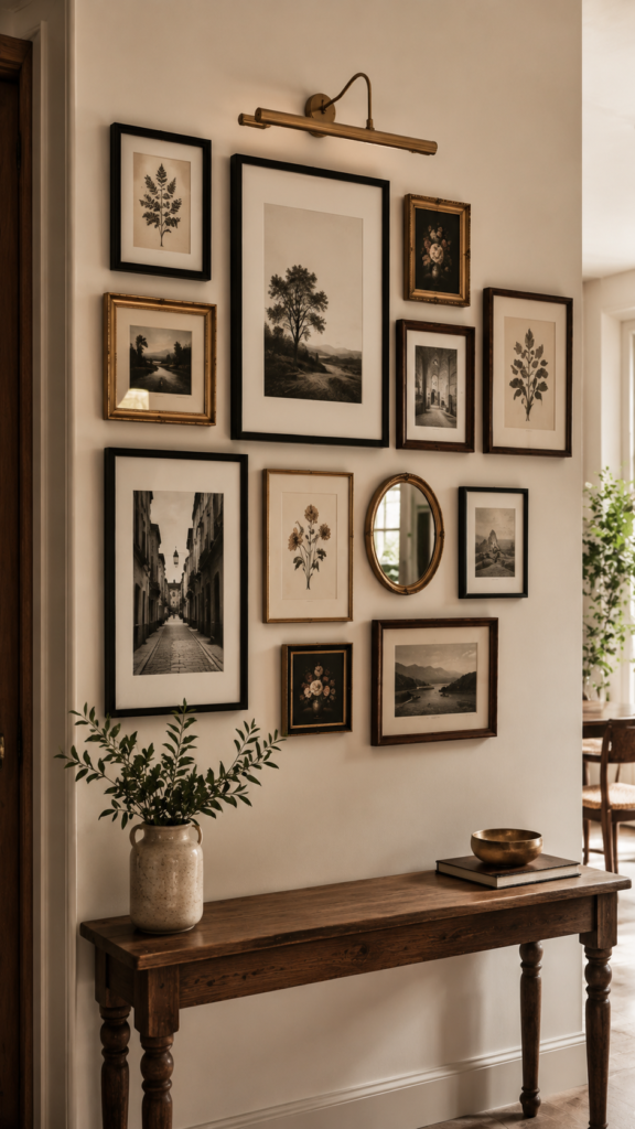
Variations to Try
- Monochrome eclectic: All black-and-white photography and line art, varied frame styles, single color story.
- Object-heavy eclectic: Woven wall hangings, plates, and small mirrors mixed in with roughly half as many framed pieces.
- Family archive wall: Vintage family photos alongside new prints, unified with matching mats.
- Travel-inspired eclectic: Postcards, maps, and photography collected from specific trips, framed uniformly.
FAQ
How many pieces do I need for an eclectic gallery wall? Most successful walls use between 7 and 15 pieces. Fewer than that starts to look sparse; more requires very careful spacing to avoid clutter.
Do all the frames need to match? No. Aim for one shared element — frame tone, mat color, or a recurring hue in the art — rather than matching every frame.
What height should the center of the wall sit at? Roughly 57-60 inches from the floor to the center of the whole arrangement, which lines up with average eye level.
Can I do this in a rental? Yes. Use adhesive strips rated for the weight of each frame, or a single rail system that requires only a couple of wall anchors instead of many nail holes.
What if I only have a few pieces to start? Start with a smaller, tighter cluster and leave room to grow outward. An eclectic wall is meant to be added to over time.
The best eclectic gallery walls aren’t finished so much as they’re paused — there’s always room for one more frame when you find it.