Terracotta used to live in one place: the patio. Now it’s showing up on sofas, accent walls, and even ceilings in living rooms that have nothing to do with the outdoors. Part of the shift is fatigue with grey — after a decade of cool, neutral living rooms, people want a room that feels warm the moment they walk in.
But terracotta is a color that punishes guesswork. Go too orange and a room looks dated fast. Go too muted and it just reads as beige with an attitude. This guide breaks down where terracotta actually belongs in a living room, what it needs around it to look intentional, and where most people go wrong.
Why Terracotta Works in a Living Room
Terracotta sits in an unusual spot on the color wheel — warm enough to feel cozy, earthy enough to feel grounded, and just saturated enough to read as a real design choice rather than an accident.
Unlike red, it doesn’t demand attention. Unlike beige, it doesn’t disappear. That middle ground is exactly why it works so well in a room where people actually spend hours relaxing, reading, or hosting.
It also has a practical advantage: terracotta hides a lot. Sunlight fading, minor scuffs on furniture, dust on textured fabric — none of it shows the way it would on a pale grey or white sofa.
Designer Note
Terracotta reads differently depending on the finish. A matte terracotta wall feels rustic and grounded. A glazed or lacquered terracotta surface — on a console or ceramic lamp base — feels more polished and almost jewel-toned. Mixing both finishes in one room usually looks better than picking just one.
Understanding the Terracotta Range
Not every warm orange-brown is “terracotta,” and treating them as interchangeable is where a lot of rooms go wrong.
Classic terracotta leans slightly orange, close to unglazed clay pots. This is the boldest option and works best as an accent, not a full-room color.
Burnt sienna is a shade darker and more muted, with a brownish undertone. It’s more forgiving in large doses — full walls, big upholstery pieces.
Dusty clay is the softest version, closer to a warm blush-brown. It’s the safest choice for anyone nervous about committing to a strong color.
Rust pushes redder and deeper. It photographs beautifully but can feel heavy in a small or dark room without enough light to balance it.
A useful trick before committing: paint a large sample — at least a full sheet of poster board — and move it around the room across a full day. Terracotta shifts noticeably between morning light and evening lamp light, more than most neutrals.
Where to Introduce the Color
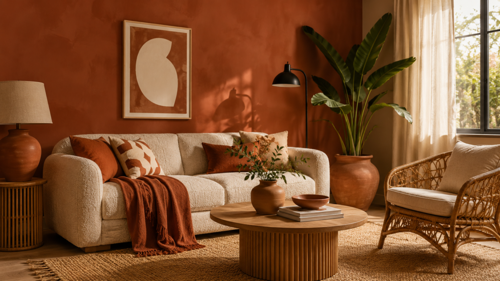
Terracotta doesn’t need to take over the whole room to work. In most living rooms, it works best in one of these zones.
The sofa. A terracotta sofa or sectional is the single biggest style commitment, but it also does the most work — everything else in the room can stay neutral and the sofa still anchors the space.
An accent wall. Behind the sofa or around a fireplace, one terracotta wall adds warmth without asking every other surface to match it.
Textiles only. Cushions, a throw, and a rug in varying terracotta tones is the lowest-risk entry point. It’s also the easiest to change later if your taste shifts.
Ceiling color. An increasingly popular move — painting the ceiling terracotta while keeping the walls white or off-white. It gives the room a warm “glow” from above without overwhelming the eye at seated height.
Trim and door frames. A more restrained option for people who want the color as a detail rather than a statement — terracotta trim against a soft white wall reads as considered, not accidental.
Material and Color Pairings That Work
Terracotta rarely fails on its own. It fails when it’s paired with the wrong supporting materials.
- Cream and off-white give terracotta room to breathe — the safest, most reliable pairing in almost any living room.
- Sage or olive green creates a warm-earthy combination that’s become one of the most requested living room palettes this year.
- Black metal accents (lamp stands, window frames, coffee table legs) sharpen terracotta and stop it from feeling too soft.
- Natural rattan and cane furniture leans into the earthy, sun-baked feeling terracotta naturally has.
- Warm wood tones, especially oak and walnut, ground the color instead of competing with it.
- Avoid pairing with cool grey — it’s one of the most common mismatches, and it tends to make both colors look slightly off rather than complementary.
Quick Win
If a full terracotta sofa or wall feels risky, start with a set of ceramic terracotta lamp bases or a large glazed terracotta vase. It gives you the color at eye level without touching a single wall or piece of upholstery.
Furniture That Suits a Terracotta Room
Terracotta living rooms tend to favor furniture with a handmade, slightly organic quality rather than sharp, glossy modern pieces.
| Piece | Why It Works |
|---|---|
| Boucle or linen sofa in cream | Lets a bold terracotta wall or rug take the lead |
| Rattan or cane armchair | Reinforces the earthy, natural feel |
| Fluted wood coffee table | Adds texture without adding more color |
| Woven jute or wool rug | Grounds the room and softens hard flooring |
| Curved, low-profile seating | Suits the softer, rounded feeling terracotta rooms usually aim for |
Furniture with straight, sharp lines can still work, but it needs a softer material — think a linen-upholstered sofa rather than leather, which can feel too formal against a warm, earthy palette.
Lighting Considerations
Terracotta is a warm color, and warm lighting is what makes it look intentional rather than dull.
Warm white bulbs (around 2700K) bring out the richness in terracotta walls and furniture, especially in the evening. Cooler daylight bulbs (above 4000K) can flatten it, pulling it toward a dull brownish-grey that loses the warmth entirely.
Layered lighting matters more here than in a neutral room. A single overhead light on a terracotta wall creates flat, uneven shadows. A mix of a floor lamp, a table lamp, and a dimmable overhead fixture lets the color shift and glow depending on the time of day.
Designer Note
Natural light plays a big role too. South- or west-facing living rooms, which get warm afternoon light, tend to make terracotta look richer and more golden. North-facing rooms may need slightly more artificial warm lighting to avoid the color reading as flat or muddy.
Layout Tips for a Terracotta Living Room
The color itself doesn’t dictate layout, but a few placement choices help it read as deliberate.
- Keep the terracotta surface as the visual anchor of the room — usually the largest wall or the main seating piece — and let everything else support it.
- Balance a bold terracotta zone with at least one large area of light, neutral space, like a cream rug or a pale wall, so the eye has somewhere to rest.
- Avoid placing terracotta directly opposite another strong, competing color. It works best next to neutrals, greens, or warm woods, not against cool blues or stark black.
- If the room is open-plan, use terracotta to visually define the living zone without needing a physical wall — a rug or an accent wall does the job.
Small Space Ideas
Terracotta has a reputation for making rooms feel smaller, but that’s really only true of the deepest, most saturated shades used floor to ceiling.
In a compact living room, dusty clay or a lighter burnt sienna tends to work better than a deep rust. Keeping the color to one wall or the textiles, rather than the whole room, also helps.
Mirrors placed opposite a terracotta wall bounce light back into the room and soften the sense of enclosure. Pairing the color with a light-toned floor — pale wood or a cream rug — does more to open up a small space than almost any other single decision.
Common Styling Mistakes
Using terracotta and true orange interchangeably. They’re not the same. Terracotta has a muted, earthy undertone; a bright, saturated orange reads as a completely different, much louder color in the same room.
Skipping the sample stage. Because terracotta shifts so much under different lighting, a shade that looked perfect on a small chip can look noticeably different across a full wall.
Overloading the room with too many warm tones at once. Terracotta, rust, and warm wood all together, with nothing cooler or neutral to break it up, can feel heavy rather than cozy.
Forgetting texture. A flat-painted terracotta wall next to smooth, glossy furniture can look one-dimensional. Terracotta tends to look best next to something textured — linen, rattan, or a raw-plaster finish.
Budget Picks vs. Luxury Picks
| Element | Budget-Friendly Approach | Higher-Investment Approach |
|---|---|---|
| Color introduction | Terracotta throw pillows and a small area rug | Full terracotta sofa or a professionally painted feature wall |
| Wall texture | Textured wallpaper in a terracotta tone | Hand-applied limewash or Venetian plaster |
| Lighting | Warm-toned LED bulbs in existing fixtures | Ceramic terracotta table lamps with brass fittings |
| Accessories | Terracotta ceramic vases from a homeware retailer | Handmade, artisan-glazed terracotta pottery |
Both approaches can look equally considered — the difference usually comes down to texture and finish, not how much of the room is covered in color.
DIY Improvements
A weekend project that makes a noticeable difference: repainting a set of terracotta-toned terracotta pots (the plain, unglazed kind) with a matte ceramic sealant. It deepens the color slightly and gives them a more finished, indoor-ready look instead of a raw garden-pot appearance.
Dyeing a plain linen throw or cushion covers in a rust or clay dye is another low-cost way to test the palette before committing to furniture or paint.
For anyone comfortable with basic painting, a half-wall of terracotta — painted only up to picture-rail height, with white above — is an easier DIY than a full wall and gives a similar warm effect with less risk.
A Simple Styling Formula
For anyone unsure how much terracotta is enough, this ratio tends to hold up across most living rooms:
- One dominant terracotta surface — a sofa, a wall, or a large rug.
- One neutral, light-toned material to balance it — cream upholstery, a pale wood floor, or white walls.
- One green or wood accent to reinforce the earthy feel — a plant, a walnut side table, or rattan seating.
- One metal accent — black, brass, or aged bronze — for contrast and definition.
Rooms that follow roughly this mix tend to feel styled on purpose, rather than like the color took over by accident.
Frequently Asked Questions
Does terracotta clash with existing wood furniture? Not usually — warm woods like oak and walnut tend to pair naturally with terracotta. Cooler, greyish wood finishes are the ones that can feel slightly mismatched.
Is terracotta too dark for a north-facing room? A deep rust can feel heavy without much natural light, but dusty clay or a muted burnt sienna, combined with warm lighting, still works well in rooms that don’t get direct sun.
Can terracotta work with a grey sofa I already own? It can, but it needs a buffer — a cream or wood-toned rug between the two tends to soften the contrast so they don’t compete.
Final Thought
Terracotta earns its place in a living room the same way any good earth tone does — by acting less like a paint color and more like a material the room was built with. The living rooms that pull it off aren’t the ones with the boldest wall. They’re the ones where the color feels like it belongs, sitting quietly next to wood, linen, and warm light instead of shouting over them.